Provincial Data – Raw and Smoothed – 6/18/20
These graphs show data related to the covid-19 pandemic in Canada.

These graphs show data related to the covid-19 pandemic in Canada.
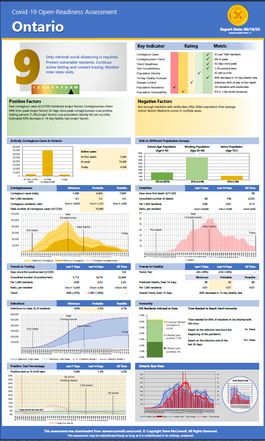
These assessments show state-level data that can help assess the state of the pandemic in each province.
These graphs show data related to the covid-19 pandemic in Canada.
These graphs show the 7-day trends in positive test results for each province. The data has been retrieved from the Government of Canada. The graphs compare the number of positive tests for the most recent 7-day period to the results for the preceding 7-day period. In other words, they compare the most recent days Read more
These graphs show the history of contagiousness in each province. Contagiousness is calculated as the number of people who are actively infected for the 8-period from 3 days before a positive test to 4 days after. Total number of people infected is calculated using the two infection models. Read more
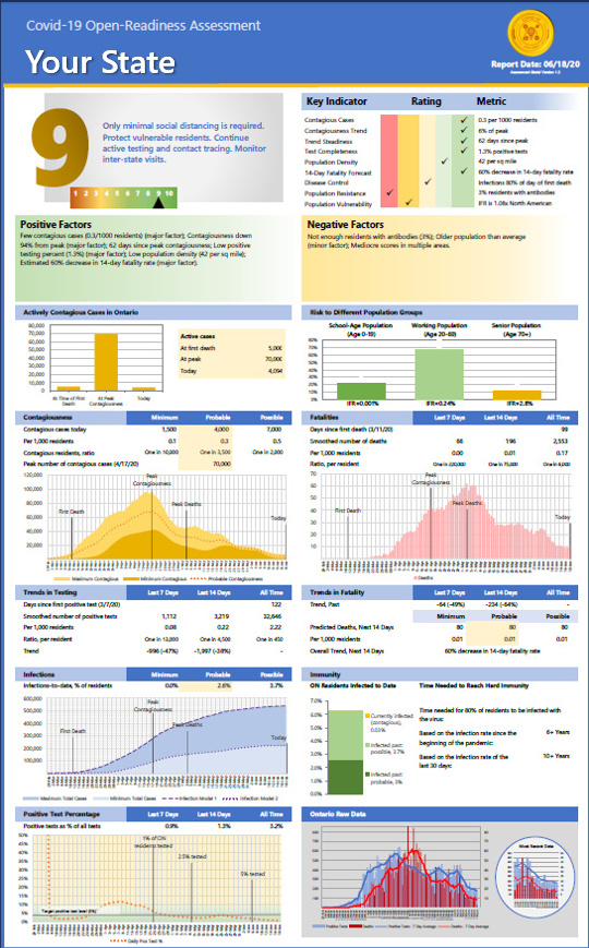
These assessments show state-level data that can help assess each state's readiness to reopen.
These graphs show data related to the covid-19 pandemic in the US. We're starting to see more positive tests, and the trend for the past few days has definitely been up. My estimation model is predicting a slight increase in the death rate over each of the next 2 weeks. Read more
The percentage of virus tests that show positive results ("positivity") is an indicator of the percentage of the total infections that is being identified through testing. The higher the positivity is, the lower the percentage of overall infections being detected is. Most states started with high positivity (in some cases 30-40%) and are now Read more
These log graphs provide a different perspective on the rate of Covid-19 positive tests and deaths. On most graphs, the x-axis is time. On these graphs, the x-axis is the total number of cases to date, and the y-axis is the number of cases added incrementally each week. As the pandemic winds down, the Read more
These graphs show data related to the covid-19 pandemic in the US. People have been asking whether (a) states opening up, or (b) protests are resulting in more cases of covid-19. If they are, it isn't showing up in the national data. Test cases have resumed their downward trend nationally. Read more