State Testing Trends – 6/23/20
These graphs show data related to the covid-19 pandemic in the US.

These graphs show data related to the covid-19 pandemic in the US.
These graphs show data related to the covid-19 pandemic in the US.
This video shows the history of positive test results in each state. Each state's point on the graph represents the number of positive tests per 1000 residents for the 7 day period indicated at the top. The solid bar represents where the state was 7 days prior to that. The hollow bar represents where Read more
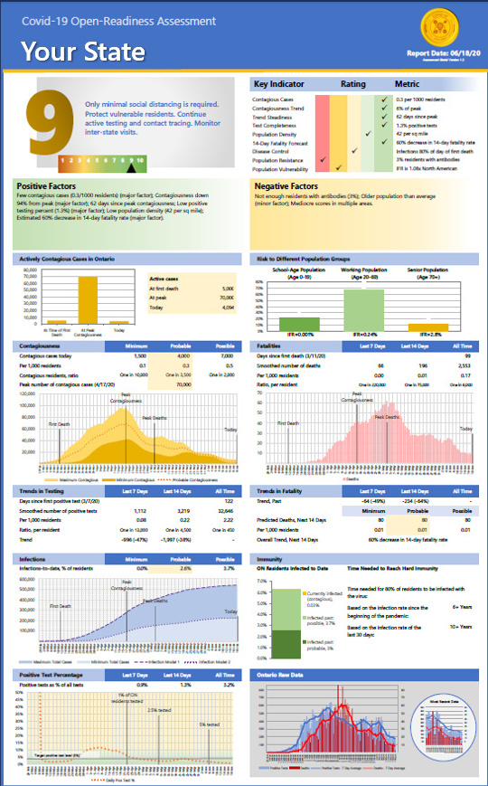
These assessments show state-level data that can help assess each state's readiness to reopen.
These assessments show state-level data that can help assess each state's readiness to reopen.
The percentage of virus tests that show positive results ("positivity") is an indicator of the percentage of the total infections that is being identified through testing. The higher the positivity is, the lower the percentage of overall infections being detected is. Most states started with high positivity (in some cases 30-40%) and are now Read more
These log graphs provide a different perspective on the rate of Covid-19 positive tests and deaths. On most graphs, the x-axis is time. On these graphs, the x-axis is the total number of cases to date, and the y-axis is the number of cases added incrementally each week. As the pandemic winds down, the Read more
These graphs show data related to the covid-19 pandemic in the US.
These graphs show data related to the covid-19 pandemic in the US.
These graphs show data related to the covid-19 pandemic in the US.