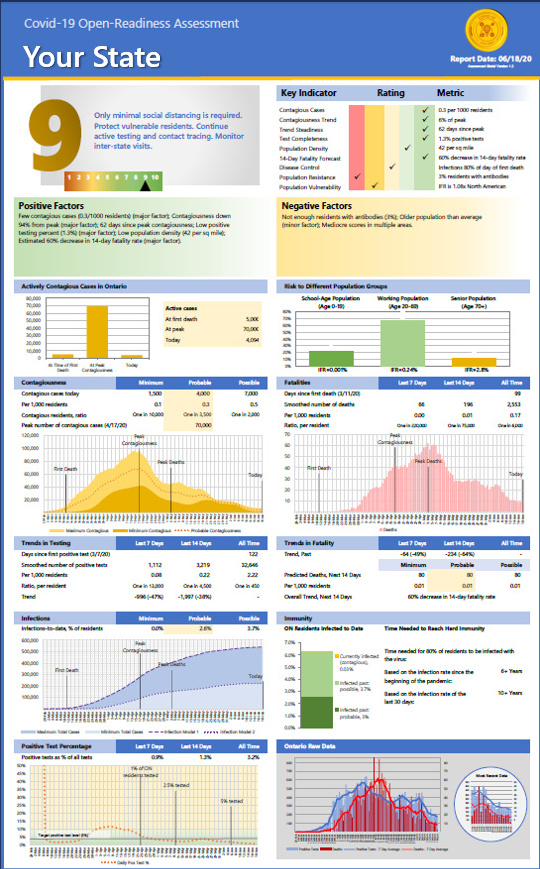
Provincial Testing Trends 6/18/20

These graphs show the 7-day trends in positive test results for each province. The data has been retrieved from the Government of Canada. The graphs compare the number of positive tests for the most recent 7-day period to the results for the preceding 7-day period. In other words, they compare the most recent days Read more

By |2020-06-20T00:32:53+00:00June 19th, 2020|0 Comments

US Data Updates 6/16/20

These graphs show data related to the covid-19 pandemic in the US. We're starting to see more positive tests, and the trend for the past few days continues to be up. Deaths are still declining, despite the positive tests increasing significantly 10-15 days prior. Read more

By |2020-06-18T03:15:58+00:00June 18th, 2020|0 Comments

US Data Updates 6/14/20

These graphs show data related to the covid-19 pandemic in the US. We're starting to see more positive tests, and the trend for the past few days has definitely been up. My estimation model is predicting a slight increase in the death rate over each of the next 2 weeks. Read more

By |2020-06-15T23:38:23+00:00June 15th, 2020|0 Comments

State Log Graph Updates 6/12/20

These log graphs provide a different perspective on the rate of Covid-19 positive tests and deaths. On most graphs, the x-axis is time. On these graphs, the x-axis is the total number of cases to date, and the y-axis is the number of cases added incrementally each week. As the pandemic winds down, the Read more

By |2020-06-14T21:27:55+00:00June 13th, 2020|0 Comments

US Data Updates 6/11/20

These graphs show data related to the covid-19 pandemic in the US. People have been asking whether (a) states opening up, or (b) protests are resulting in more cases of covid-19. If they are, it isn't showing up in the national data. Test cases have resumed their downward trend nationally. Read more

By |2020-06-15T23:38:33+00:00June 12th, 2020|0 Comments
Go to Top